Showing posts with label Gene Colan. Show all posts

Saturday, February 25, 2017

Strange Saturday: Tomb of Dracula 44 cover art

I was doing some research on original cover art on Heritage Auctions comics.ha.com tonight and ran across this classic cover for Tomb of Dracula 44, which featured a certain Sorcerer Supreme doing battle against the Lord of the Vampires...

Tomb of Dracula 44 cover Dr Strange


This classic cover sold for $26,290 sold for last August! Can you believe it? I can, since the hype for the Dr. Strange movie must have driven up demand for this one. Gene Colan and Tom Palmer on the art, the line work is quite impressive in black and white! In color it seems like a hippie dream come true...

Tomb of Dracula 44 color


The cover reads Because You Demanded It! And it seemed like a no brainer, because the artistic team of Colan/Palmer drew both series. Can you imagine anything at all like this today? Two artistic titans banging out nearly 40 pages a month for two series. Sheesh! These days you're lucky to get a team doing 6-8 issues a year!

Doctor Strange 14

I always enjoyed this particular two parter, where (SPOILERS for decades ago) each character thought they had killed the other by the end of each issue. They don't make 'em like this any more, true believer!

Nuff Said.

Sunday, April 24, 2016

Howard the Duck Omnibus


The Omnibus edition of Howard the Duck's 1970s comic run has been around in two different editions. I think the first was published around 2008. After this went out of print, the Guardians of the Galaxy movie with Howard's appearance in the post credits spurred a new printing. I resisted all of this until Rich Johnston reported that Marvel was clearing out many Omnibus' and letting them go out of print. I snapped it up for less than $50, not sure if I would keep it for selling later or reading. But yesterday during Dewey's 24-Hour Readathon I decided to unwrap it and read it!


It's kind of joy to read, a real trip down memory lane. Steve Gerber wrote a nice introduction back in 2008 for the first printing, where he describes Howard's publishing history, even talking briefly about the lawsuit. He seemed to be very proud of his creation and was glad it was reprinted in the Omnibus.

The very first Howard appearance in the the 2-part Fear / Man-Thing #1 story are included, and while I love Man-Thing, the artwork seems sketchy blown up to the Omnibus size.


But the first three stories by Frank Brunner, from Giant Size Man-Thing #4-5 and Howard the Duck #1, are jaw droppingly gorgeous. His artwork translates well to these oversized pages, and I always loved the light hearted nature of these first Howard tales.


If you were around and collecting comics back then, you will remember the speculator frenzy of Howard the Duck #1. I got a copy off the newsstand but others were unable to get it, prices went up sky high. Some people said this was a rigged game by people getting bundles of comics at the distributors before they went on sale. It's nice to have this historic issue reprinted here and again, it looks fantastic. Many first issues of new series featured an appearance by Spider-Man to draw reader interest, and that happened here - it's a funny story, despite the fact part of the plot is driven by Howard wanting to commit suicide.


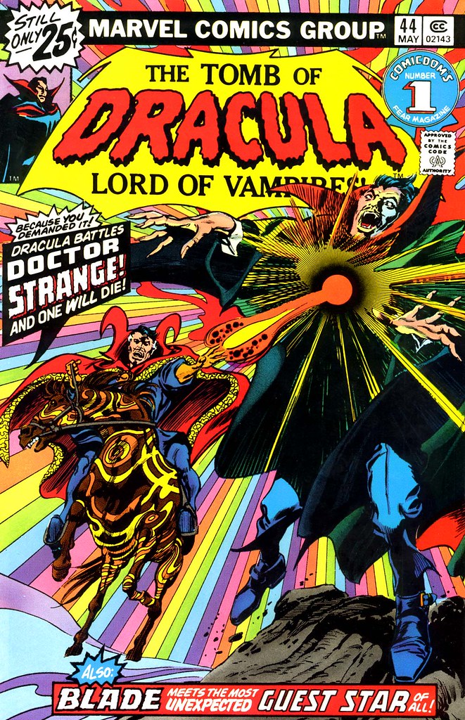
The later issues with Gene Colan's artwork are, in some cases, a bit of a letdown. The stories themselves are funny, no problem there, especially whenever the Kidney Lady or Dr Bong show up. My personal favorite is the issue where Howard meets Daimon Hellstrom and accidentally becomes the Duck of Satan. The problem I have with the artwork is that Colan's artwork doesn't look as great in this oversized format as his Tomb of Dracula work. The difference is the inking / coloring; ToD had the great Tom Palmer - that artwork stands the test of time and resizing. Not the Howard stuff, it looks a bit sketchy. It's a minor quibble and probably other collectors won't have the same feeling as I do.

Another letdown is the lack of letter page columns reprinted! The Fantastic Four Omnibus' had them, not sure why they are not included here. Stan Lee wrote a letter about how much he liked the Quack Fu story in HTD #3.


What is included is plenty of supplemental material about Howard the Duck's 1976 Presidential Campaign, including the ads for campaign buttons, which I always thought must have gone directly to Steve Gerber's home address? Berni Wrightson drew the image for the campaign button and this special lithograph in 1976.

There is also an interview between Gerber and Colan about their work on Howard. And all the remaining issues of HTD after Gerber left, which are quite frankly terrible, but none of the black and white Howard the Duck magazine.

For a fan of Steve Gerber and Howard the Duck, it's a great addition to your bookshelf. Nuff Said!


Monday, January 11, 2016

Monster Monday: Tomb of Dracula by John Paul Leon

John Paul Leon dropped this little illustration on Twitter a while ago, I was immediately entranced by it!


Tomb of Dracula! Some elements of both Gene Colan and Tom Palmer in there, but the Victorian house in the background and the inking details are more Leon. Whoever got this commission is lucky indeed! Nuff Said.

Sunday, March 17, 2013

Marvel Splash Pages (1966 - 1969) by Kirby, Buscema, Colan

My first article (The Evolution of Marvel Splash Pages) in this series focused on how splash pages were used by Jack Kirby and Steve Ditko within the pages of Spider-Man, Fantastic Four, and Dr. Strange.  What happened after 1966?

Journey into Mystery 121 splash page by Kirby 1965

I wanted to backtrack a bit and take a look at Journey Into Mystery and Thor.  Kirby was indeed using full page splashes in 1965 on that character.  Take a look at this great page from Journey Into Mystery 121 as the Absorbing Man takes new heights in his power.  Kirby uses an appropriate length page to show you how this could be a big challenge for Thor.

Thor 134 Galactus splash page Kirby 1966

Indeed, I found that Kirby used splash pages more liberally in Thor than the Fantastic Four.  Nearly every story after after 1965 had a full page splash, such as this one from Thor 134 (1966) where Galactus made an appearance.

Fantastic Four 57 Doctor Doom Silver Surfer splash page Kirby 1966

Over in the Fantastic Four, after the Galactus trilogy was done, Kirby used full pagers much more frequently.  Not every issue, but when the story demanded it--and with Kirby, it often did!  Fantastic Four #57 featured this classic scene where Doctor Doom had stolen the power cosmic from a very naive Silver Surfer.

Doctor Strange 177 transformed into masked mystic

What about Gene Colan?  He started using full page illustrations quite liberally as well in Daredevil, Sub-Mariner, and other titles.  One of his most infamous full pagers was this monumental page revealing the new costume in Dr. Strange 177 (1968). I say infamous as not all fans love this costume as much as I do.

Captain Marvel 2 splash page Gene Colan 1968

If you flip thru a Marvel Comic by Colan, more often than not you will see a full page illustration for dramatic effect.   Even this flashback scene, from Captain Marvel #2 in 1968, brings out Mar-Vell's early adventures fighting the Skrulls.

Silver Surfer 01 1968 John Buscema splash

John Buscema used splashes as well, though a bit less liberally than Colan or Kirby.  He drew this classic page from Silver Surfer #1 (1968), featuring the moment that Norrin Radd was transformed by Galactus.

Avengers 58 John Buscema splash 1968

Over in the Avengers, one of the first usages of a full page splash occurred in Avengers #58 (1968) which had two such occurrences!  The first one had a little recap of Avengers history featuring their most prominent members.  I can't understand why Spider-Man is here, he wasn't an Avenger at all during the early period!  He had an early team-up with them but that was about it.

Avengers 58 Even an Android Can Cry John Buscema 1968

The classic ending scene to this story featured the Vision, in his iconic "Even An Android Can Cry" page.  This was the second story to feature the android Avenger and the team debated whether to allow him to become a member of the team.  A bit of an unusual case for a full page illustration, which is normally used for an action scene, but here it is a highly emotional moment.

Fantastic Four 072 full color Silver Surfer splash by Jack Kirby and Joe Sinnott 1967

Back to Jack Kirby, who created one of the best splash pages ever in Fantastic Four #72 in 1968, featuring the Silver Surfer soaring over Manhattan.

There were probably many many Silver Age Marvel splashes that I didn't have room to include here.  I am left with another question, though: when did double page splashes become the norm?  Kirby started using them quite frequently in his DC Comics work.  Mike Grell made the double page splash intro a regular thing in Warlord.  I can't quite remember how this caught on with Marvel and intend to investigate that topic later.  For now, Nuff Said!


Wednesday, April 11, 2012

Sub-Mariner by Gene Colan and Drew Geraci

Sub-Mariner commission by Gene Colan, inked by Drew Geraci

Here is a nifty illustration of Prince Namor the Sub-Mariner in his element by Gene Colan (in March 2000) and Drew Geraci (inked in 2004).  Thanks to Drew for pointing this one out to me, it brought back memories of the Dean on old wingfoot.

Sub-Mariner 11 cover by Gene Colan 1968

This got me to thinking...how many covers did Gene Colan draw for Sub-Mariner's own series, excluding Tales to Astonish?  The answer is...only one!  Most of the early covers were illustrated by John Buscema.  Sub-Mariner #11 from 1968 was the only cover featuring Colan's work, with Namor bearing down the sight of a periscope.

Sub-Mariner 11 splash page by Gene Colan, Imperius Rex

It is a story with an ironic twist.  Namor makes a big sacrifice to save a seaside port, then gets rewarded for his trouble by being attacked by the Navy.  You can see the result of this bad decision when he clobbers a warship on his own:  Imperius Rex!  Never say your not entitled, Namor wouldn't dare.  Nuff Said.

Sunday, January 22, 2012

Strange Sunday: Dr Strange Black Light posters

Back in the late 60s / early 70s, Marvel licensed their characters for a series of Black Light posters.  These vibrant posters sprang to life when illuminated in the glow of black light bulbs.  Many characters received the treatment, but the one hero who was featured on more posters than anyone else was Doctor Strange!

Doctor Strange and Eternity Black Light poster by Gene Colan

The best poster IMHO was the one above, featuring Doc facing off with Eternity.  Dr Strange is in his masked superhero costume, which I loved more than many of you.  This costume, the swirling madness of Eternity, and the color scheme make this image a perfect choice for a black light poster.  You have to place yourself back in that context: sitting in a Berkeley apartment, taking a little hit of whatever to expand your cosmic consciousness, playing Pink Floyd and looking at Doc under the light.  None of which I did, btw, but that was the target audience of these posters!

Dr Strange 180 1969 cover by Gene Colan

The above and below posters were taken from splash pages inside Doctor Strange 180 (1969) with artwork by Gene Colan and Tom Palmer.  There is something interesting about this particular cover.  I wanted to confirm that Gene Colan drew the cover--I was pretty sure that he did as Doc looks to be in a typical Colan pose.  However, Marvel Wikia states that the cover is collaboration between Colan and Steve Ditko!  The figure of Eternity must have been lifted from an earlier Ditko drawn comic and pasted in here.

Doctor Strange- Eternity

The opening splash page was also made into a poster. As someone else said, this looks like it was taken from a rather bad copy.  It should have been really groovy but it looks murky.

Doctor Strange

This landscape panel of Doc entering a typical Ditko landscape was also a poster.  Who was the artist?  Not Ditko or Colan, that is obvious if you are a Marvel fan.  My best guess was Dan Adkins, who drew the series in the 1960s before Colan came on board.

Dr Strange 171 1968 double page splash by Tom Palmer and Dan Adkins

The real answer is that this is from Doctor Strange #171 (1968), a rarity in that Tom Palmer (most famously known as a superb inker/colorist for most of his career) actually penciled this issue, with Dan Adkins embellishing!  Pretty cool scene and worth of a poster, they must have chosen this one because it was a double page spread.

You have to wonder what a Steve Ditko splash page would have looked like as a black light poster.  If you want to see more Marvel black light posters, please visit artist Nick Derington's page on Flickr where he has a lot of them.  Nuff Said!

Monday, January 2, 2012

Monster Monday: Dracula by Gene Colan and Gabriel Hardman

Hope you all have today off, if not, this little illustration may help you through a Monstrous Monday...


Dracula, pencils by Gene Colan in 2003 and inks by Gabriel Hardman in 2011.  Courtesy of Hardman's deviantART page.  Nuff Said!

Sunday, October 24, 2010

Strange Sunday: Dracula versus Doctor Strange by Gene Colan and Tom Palmer

One week until Halloween 2010!  Halloween always brings back the classic Marvel Monsters in my memory.  Here's a piece that I've been saving for this occassion: Gene Colan and Tom Palmer celebrating the first time Doctor Strange encountered Dracula.

Dracula vs Doctor Strange by Gene Colan and Tom Palmer

I forgot the original source for this illustration!  But I believe it must be from one of the early calendars that Marvel produced.  Dracula glories in his triumph over the Master of the Mystic Arts, who made the mistake of attacking him in his coffin boudoir.

Tomb of Dracula 44 Doctor Strange versus Dracula

Doc first fought Drac in 1976, in a special two-issue cross-over event that was drawn by Colan and Palmer.  Part 1 was in Tomb of Dracula #44, written by Marv Wolfman.  The cover for this issue seemed very psychedelic to me, almost Dali-esque.  Most of the Dracula covers are dark, fearful, mysterious, or suspenseful.  This is probably the brightest colored cover in the history of this title.  By the end of the story, Dracula has sunken his fangs into Doc and looks forward to turning him into a vampire.

Doctor Strange 14 1976 cover by Gene Colan and Tom Palmer

The fight continued over into Doctor Strange #14, the very same month, written by Steve Englehart.  This cover is still great, though it isn't as ground-breaking as ToD #44.  Doc Strange doesn't let a vampire bite stop him, not with an astral form who can torment Dracula until he forces a resolution.

I was really into both of these titles as a young Marvel collector.  I thought the writing by Wolfman and Englehart was great, and of course, the artwork by Colan and Palmer was superb.  Just a month before this event, Englehart had announced that Doctor Strange was successful enough to transition to monthly publication.  The only problem that presented to them was having Gene Colan and Tom Palmer draw 2 books per month.  The artistic team decided to go for it, and in this two-part special, they just knocked it out of the ballpark for me.  Nuff Said!

Friday, March 5, 2010

Visions of the Scarlet Witch: Neal Adams and Gene Colan

Here's a super-heroine long overdue for a comeback: the Scarlet Witch.  These two drawings can remind us why she is a great character...

Neal Adams Scarlet Witch drawing

Neal Adams did this pencil and ink drawing of Wanda conjuring up a spell.  If you go to the Neal Adams website, click on his store to find more sketches for sale.
Gene Colan Scarlet Witch Commission 2001

Gene Colan did a brilliant pencil drawing of the Scarlet Witch fighting a pair of nasty serpents in this 2001 commission.  Check out Colan's site for more! 

I'm hoping that the Scarlet Witch will return in one of the new Avengers titles coming in June.  Could she be one of the Secret Avengers?  Nuff Said!

Sunday, May 17, 2009

Strange Sunday: Gene Colan Masked Dr. Strange Splash

An unpublished splash page featuring the masked Doctor Strange by Gene Colan!  I think this looks so good, it could be a poster.

Doctor Strange masked splash page

I discovered this piece while searching for new pictures of Doctor Strange.  Howard Hallis has a terrific fan site with an incredible gallery of Doctor Strange artwork.  Both commissions and original art pages by Brunner, Colan, Finch, Bereton, etc.  Very cool, you should check it out.  Nuff said.

Monday, February 16, 2009

Monster Mondays: Blade the Vampire Slayer

Tomb of Dracula 10, 1973, His Name is Blade!

Back in 1973, vampire hunting was the province of white dudes with English accents.  But Marv Wolfman and Gene Colan shook up that entire dynamic when “His Name is—Blade!” appeared in Tomb of Dracula #10!  He was athletic and street smart in a way no other vampire hunter had ever been.  Blade was the only guy who did what I thought was common sense: don’t bring just one stake—bring a dozen wooden knives to kill those suckers with!

Tomb of Dracula 12, Blade fighting Dracula

Blade wasn’t afraid to get physical with Dracula.  Looking back at these old issues, I wonder if we would have had Buffy without Blade?  Blade’s daring and physical prowess in this series almost seems like a blueprint for Buffy.  Blade’s “costume”—trenchcoat, glasses (to protect his eyes from blood spatters) and blade-holding sash belt—may seem funny today, but back then it was pretty cool.

Tomb of Dracula 12, Blade takes no crap from Drake

Nor did Blade take any guff from the rest of the Dracula-hunters (Quincy Harker, Frank Drake, etc).  In Tomb of Dracula #12 he told Quincy his origin story—that a vampire attacked his mother as she was giving birth to Blade!  Little did we know that this vampire—Deacon Frost—was also the maker of vampire detective Hannibal King.

Tomb of Dracula 13, Blade kills Dracula

In Tomb of Dracula #13, we were stunned to see that Blade had actually succeeded in staking Dracula through the heart.  However, killing Dracula and ending Dracula were two separate things.  A horde of villagers were able to carry away Dracula’s body before Quincy and Blade cut remove his head.  Dracula was revived in Tomb of Dracula #14 by a disillusioned preacher.

Tomb of Dracula 19, Blade discovers he is immune from vampire bites

Tomb of Dracula reads like a 70 part max-series when you go back and re-read it.  Dracula takes revenge upon Blade in TOD #17 by forcing him down and drinking his blood.  By TOD #19, Quincy Harker has found Blade’s body and is prepared to put a stake through his heart.  Not so fast, Jack!  It turns out that Blade is immune to vampire bites, as a result of Deacon Frost’s attack at birth.

Tomb of Dracula 42, Blade and Doctor Sun

Just as I mentioned about the Falcon drawing me into Captain America, Blade—while not the single most important element—definitely helped make Tomb of Dracula one of my top favorite all-time Marvel comics.  He’s featured on a number of TOD covers, including this one (#42), the only original art cover that I own.

Blade pinup by Gene Colan Marvel Preview 3, 1975

This nifty pinup here, by Gene Colan, appeared in the black and white magazine Marvel Preview #3, Blade’s first solo adventure!  It looks like a rare piece that Colan inked himself.

I definitely think that Blade is one of the best creations that came out of Marvel during the 1970s.  Marv Wolfman and Gene Colan gave Marvel an incredible gift that resulted in the Wesley Snipes films.  It’s unfortunate that they do not share more of a financial royalty from Blade. 

This concludes Black Marvel Heroes from the 1970s week, hope you enjoyed revisiting Brother Voodoo, Black Panther apartheid, Panther’s Rage, Power Man, Power Man in the FF, the Falcon, and Storm!  As one commenter wrote, maybe there should be a super-team with all these dudes!  Nuff said.

Sunday, January 25, 2009

Strange Sunday: Dr. Strange, Masked Superhero

I started reading Doctor Strange in 1970, first in reprints contained in Marvel Tales, then later in Marvel Premiere.  Always one of my favorite characters, but when I unearthed Dr. Strange #177 (volume 1, circa 1968), I was astonished to see that the good Doctor once wore a mask:

Doctor Strange 177

Not only did Doc have an earthly mask (which gave an other-worldly Spectre or Phantom Stranger type of appearance with white eye-slits), there were other improvements.  Whereas Doc’s original costume was more Eastern, with billowing robes and a sash, the new costume had removed those elements.  Now he had a streamlined costume, skintight, with new boots and flared gloves.

This cover by Gene Colan and Tom Palmer became an instant classic.  Marvel even made a poster out of it, which I managed to find and put on my wall.

Roy Thomas, who wrote the series at that point, came up with a convenient excuse for the costume change:

Doctor Strange 177 transforming

The villain Asmodeus had assumed Strange’s identity on Earth, and had trapped Doc and Clea in another dimension.  In order to escape, Doc needed to transform…

Doctor Strange 177 transformed into masked mystic

As this dynamic splash page proudly displays!  The real reason for the costume change was the downward sales spiral on Doctor Strange.  He’s never been a strong seller within his own title.   The costume lasted from Doctor Strange 177 to 183.  When the Doctor popped up a year or so later in the Defenders and Marvel Premiere, he reverted back to his original Ditko designed outfit.

There have been two attempts to bring back this costume.

Defenders, The Order 5 by Pacheco

The first was the 2002 mini-series The Order, which featured the Defenders reuniting to conquer the world (under the mind-control of Yandroth).  The story wasn’t the greatest, but it featured great covers by Carlos Pacheco.  Doc really becomes the focal point of this cover in The Order #5.

HULK Defenders poster

The next costume revival will occur just one month from now—in Hulk #10, on sale in late February 2009.  Hulk once again teams up with his former Defenders to battle Red Hulk and his team of Offenders (Baron Mordo, Tiger Shark, and Terrax), courtesy of Jeph Loeb and Ed McGuinness.  I can’t wait for this story arc.  I think I heard on Word Balloon that Loeb is pulling the Defenders out of different time periods.  Notice that McGuinness has made one slight alteration—he kept the Ditko curves on the top part of the cape, instead of the Colan designed spikes.

Despite the failure of the Doc’s superhero-look to ignite sales in the late 60s, I think Marvel should reconsider using this costume for the modern era.  I think there are two big barriers to Doctor Strange’s popularity.  One is the fact that he looks like a middle-aged man.  The second is that he saves the world in baggy pajamas.  Just as Thor and Iron Fist needed a little revising to make them more attractive to modern readers, I think the same can be said for Doc.  Nuff said.

Update: Comments from my old MT blog...


3 Comments

Bite your tongue! The blue period was a low for the character. Save the full mask look for Vizh and Silver Surfer. I know where you're coming from, but, as a woman, I LOVE that Doc is a middle-aged man. He's really not much older than Tony Stark or many of the others, and, gosh darn it, he's sexy.
Now, now, you guys get super-boobed babes, give us few female comic fans something to enjoy too! Thank you naked Tony Stark!
For me, it's important that Doc not be masked. Aside, from the Hello, Doctor! factor, it's important because he has no secret identity. His lack of a mask is representative of his "what you see is what you get" style. He's honesty personified, no subterfuge, no games. He's given up any other life to be the Sorcerer Supreme.
So, while I'm thrilled he's getting back together with the old gang, I hope the blue face is a brief arc. Maybe he's been walking the earth again and this is the rebirth to his newfound inner peace, the coccoon he will emerge from. Or not. :-)
Anyway, great blog. Sorry for the ramblies.
I believe there was also a brief period in the '90's when the mask made a comeback. Right around the time that a younger Dr. Strange w/ long hair and Lennon-style sunglasses became the "default" doctor, however temporarily. Don't recall the entire storyline or justification, but it wasn't very good.
-r-
The blue faced Doc Strange was a stupid idea. First, it looked as if the Silver Surfer was wearing a modified Doc Strange get up. It fact, the first I saw this version of Doc Strange was in a Defender comic, in a flashback sequence. I was totally confused as who wearing a modified Dr.Strange look, with the Surfers face.Doc Strange,s true is his costume is the original one, not blue faced version of the Silver Surfer-which I'm might had some bearing why this design was chosen. Now the look might have worked another character-an alien sorcerer, similar to Doctor Strange, but really do these major alterations work major characters, unless costumes really stink like say Thor.
The blue faced period was a low for the character. Save the full mask look for the Vision and Silver Surfer. Doc Strange work as he was originally presented. Costume changed generally isn’t the problem. It’s always bad storytelling that kills a book, not cosmetic look to attract the narrow minded boobs who need the same here that they are getting elsewhere. The thinking is to make cooler-with it, to current generation, who something is old or corny, who will start buying something they never planned to buy anyway. Often it shows desperation and stupidity on the part of the producers of the material and misguided fan boys, who become producers of such material, begin it must have cool, when was out when I was young decide to bring it back again. Well if it didn’t work then, then it won’t work now or years from now. Like the look, give it another character-maybe an alien Doctor Strange or one from alternate reality-not the standard character.